In what ways does your media product use, develop or challenge forms and conventions of real media products?
_______________________________________________________________________
Our music video for ‘The Aquatic Escape – Gryphen Ford’ was inspired and influenced by a variety of different existing media products and musical outlets, and contains various notable themes. First of all, it appears to use the conventional form of a narrative as the character/artist is seen partaking in some sort of journey and travelling throughout. This narrative form is seen in numerous existing music videos and plays an important part in conveying the story of many artist’s/band’s music. However, our video subverts this clear narrative convention by containing a sense of enigma as it isn’t clear throughout where the character is going or what his journey is for; leaving the audience in suspense of where the character will end up and what the climax of the video will be.
Small Bump - Ed Sheeran
The Girl - City and Colour
Another comparison that could be made is that with the video of ‘The Girl – City and Colour’, in which the introductory shot is the artist sitting on a stool under a bridge. The juxtaposition of home furniture with natural surroundings appealed to us and seemed appropriate for conveying the themes we had expressed interest in (indie/humble character, solitude). We took this further by using a bright blue inflatable chair, making the juxtaposition even clearer and further expressing the characters distance from other people and his surroundings.
The final climax of our video could be compared with that of Ed Sheeran's 'A-Team', as this video contains a similar 'shock factor' at the end. The video revolves around the theme of a prostitute's daily routine and features her taking drugs and supposedly dying in the final scene. This is similar to the scene in our video of our main character walking into the sea and ending his as the climax, which is unexpected and fairly shocking to the audience.
We also used a 'sun-glare' technique in our video, as this is a common convention of 'indie' style music videos and conveys more of the naturalistic mood we were trying to put across. An example can be seen in the video for 'Summer in the City' by Mikill Pane, who is also an indie/alternative artist.

A screenshot of a sun-glare used in our video.

A similar 'indie' style sun-glare in Mikill Pane's video.
How effective is the combination of your main product and ancillary texts?
______________________________________________________________________
Our main product and our ancillary products are effective together in that they retain themes as a multi-platform product. We stuck to a rigid ‘indie’ and ‘humble’ theme throughout the creation of our products, making sure everything we designed and produced was recognisable as single parts of one whole product. We used an old-style ‘ 1980s’ filter throughout the music video to keep with the indie theme, and we then applied this to the rest of our products; making sure the audience could link our CD/DVD cover and advert back to the video.
With regards to mise-en-scene, we also ensured that this remained consistent throughout our products. We used the same costume in all the promotional shots taken of the artist, allowing the audience members to recognise this costume and then relate to and link the character in all our platforms. We also made sure the lighting for each shot we used outside of the main product was similar or close to that used in the video, and that our locations were also recognisable and repeated throughout; almost making the audience feel ‘at home’ and giving them a sense of security due to the repetition. Obviously the props we used in the video were also the same ones used in the ancillary tasks, showing further continuity

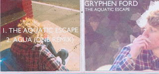
Back and front of our CD cover
How did you use new media technologies in the construction and research, planning and evaluation stages?
______________________________________________________________________
New media technologies played a big part in the planning, research, production and editing of our media product; which would not have been possible without the knowledge and access to such technologies. First of all, the blog has played a large part in the planning stage as it has helped keep all our ideas, thoughts, inspiration and notes organised and enabled our whole group to keep on track and monitor each others and our own progress whilst creating our product. It has meant we can document every idea and look back chronologically to view development within the media process, which was a significant aid in the evaluation process too as we could see everything we had changed and improved from the original statement.
To edit our raw video footage, we used Final Cut Pro. We made extensive use of the ‘RGB’ colour-editing tool to apply an old-style ‘indie’ filter to our footage; slightly increasing the red and purple hue and adding some desaturation to give it a ‘hazy’ feel.

We used cross-dissolves for transitions between some shots to fade them into each other as the overlapped, creating seamless links between them and making them flow with the music. We also discovered and made use of the ‘opacity’ tool which is used for decreasing or increasing the transparency of each shot. This meant that we could overlap shots in the editing track and decrease ones opacity to make them appear as one shot. This came in extremely useful when we wanted to juxtapose the scene of the artist walking along the train station and the scene of the artist performing on the rocks. We then also used the ‘keyframe’ feature which allowed us to move the ‘walking’ scene above the line of the water in the ‘beach’ scene; combining with the overlapping shots, making the artist appear as those he is walking along the horizon.
In the planning stages of the process, we used a scanner as a useful tool for documenting and posting images of rough ideas, mind-maps and storyboards, which then allowed us to look back and refer to them digitally.
What have you learned from your audience feedback?
______________________________________________________________________
The internet played a big part in the research part of constructing our product, as we used websites such as YouTube to freely discover and access existing products to inspire and influence us. Search engines also allowed us to easily find existing posters, CD covers, DVD covers and digipaks for research into these products and for use for analysis.
Our audience feedback was fortunately very positive, in that it reinforced our original ideas and let us know that we executed our original plan very well. From the original audience feedback the general consensus was that the idea conveyed a ‘peaceful’ and ‘fluid’ atmosphere and these feelings were also said to remain upon the audience viewing the final product. One original criticism was that we could possibly add more characters to the narrative to possibly give it a twist and make it more interesting. To cater to this, we used other members of the public as side-characters in our video, allowing a contrast or a comparison to be made between normal citizens and our humble and forlorn character/artist. This portrayed him as isolated and distant from the rest of the world.

We justified not using other actual characters as we stated that this would take away from the theme of isolation that was important in the portrayal of the character. Our feedback was useful as it consisted of people within the age-group of our target audience, (14 – 20) and showed us that our final product was received well by this audience; indicating that our video appeals to the desired range of people.
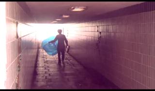
These two shots were used as a technique for 'distancing' our character and conveying isolation within our music video.
We justified not using other actual characters as we stated that this would take away from the theme of isolation that was important in the portrayal of the character. Our feedback was useful as it consisted of people within the age-group of our target audience, (14 – 20) and showed us that our final product was received well by this audience; indicating that our video appeals to the desired range of people.