Wednesday 2 November 2011

Advert/Album Analysis - Ed Sheeran '+'

This advert for the release of Ed Sheeran’s new Album ‘+’ is obviously very simple and clear. The construction of this advert is carefully thought out to appeal to the artists target audience and let them know about the album.
          Firstly, the colour scheme is extremely effective, as it uses a minimum amount of colours to ensure it appears simple but effective. The majority of the advert is made up of a distinctly bright orange, which at first glance is extremely eye catching and could be recognised anywhere. The colour is used as part of Ed’s ‘image’, and is a play on his hair colour. The fact that he has ginger hair is majorly exploited as a selling point and recognisable feature throughout his representation in various forms of media. For example at gigs, bright orange filters are used on the lighting to give the stage an orange glow, and catchy lyrics related to his hair are used in his songs. Also, a lot of the Ed Sheeran merchandise that his record label (Atlantic – Warner) sells is orange. This recurring colour scheme is used to allow fans of the artist to instantly know when something is related to Ed. The fact that the only other colours on the advert are black and white or ‘monochrome’ (and not any other distracting colours) means that a contrast can be created in order for the text to stand out, without detracting from the main colour and familiarity.
          The ‘type-writer’ style font is used to give off a simple and humble image, and has been slightly stylised and given ‘scruffy’ edges to make it appear almost hand-made and personal, as well as giving the impression that the artist is dedicated to his fan-base and appreciative. The text has been positioned from the centre down in order to leave a lot of empty orange space at the top so as not to take anything away from the image. The word ‘click’ is underlined to show the audience that they can click the word to buy the album, and adds an interactive element to the advert. Different fonts are used at the bottom for the retailers to enable the audience to recognise these brand/retail logos; however the same scruffy stylising is used to keep these logos within the theme and image of the advert. The text ‘Out now’ makes the audience aware of the albums availability, and the fact that the text ‘the no1 album’ has been used shows the sheer popularity of it, making it seem even more appealing by showing that a lot of people like it and bought it.


The image on the advert, which is the taken from the artwork on the album cover, simply depicts the face of the artist Ed Sheeran. Again, this picture of his face is constructed using only gradients of orange and white so as to stay strictly within the boundaries of the artist’s star image and the colour scheme of the advert/album. Ed’s face fades away in the orange of the background, which may have been done to create a sense of ambiguity and make him look dark and mysterious. This technique, combined with his ‘cheeky’ and partly alluring facial expression and the lighting on the image, makes the artist appear somewhat ‘sexy’ via non-verbal communication and this mysterious façade will be extremely appealing to the mass female proportion of his target audience.
          This image (which was a photo of the artist) has been edited in such a way that it looks almost hand-drawn and sketchy. Again this gives the cover a personal feel and makes it appear somewhat handmade; which could make the consumer feel special. The fact that the image has been taken in such a way that it appears as though the artist is actually looking directly at you also adds a personal feel, and again could make the consumer feel unique and allow them to relate to the image. No obvious make-up or costume has been used, and if it has then the editing has been used to mask this, making the artist appear fairly natural. This gives it a ‘humble’ look and specifically makes the artist not appear fake or ‘made-up’. Again fans can relate to this as it gives the impression that Ed Sheeran is just a normal human being.


Sunday 30 October 2011

Intro and Ending filming

Our initial concept for the beginning and ending of our music video was a lift to be used as a sort of metaphorical 'transport' or 'vehicle' which would envelope our artist/characters' journey. However upon arrival and review of our original location the lift we were using was much too small for the desired shot and the lighting was not at all right for the shot, meaning we had to abandon this and possibly look for a new location.
We are now looking back and re-thinking the start and finish of our video.

Friday 28 October 2011

Star Image - Katy Perry


Californian pop-star Katy Perry’s image is very cleverly crafted to appeal to an extremely vast fan-base and target audience.
With regards to the general representation of Katy across many forms of media, it is clear that herself and her record label are presenting her as a ‘youthful’, ‘fun’, ‘bubbly’ and ‘sexy’ singer. Her sound is very commercial; therefore her image must reinforce this by appealing aesthetically to her audience. One of the main elements that attract people to Katy Perry is the fact that although she uses crazy, fun costumes, puts on extravagant shows and has an extremely commercial sound, she still comes across as natural and isn’t regarded as a ‘fake’ star; it is quite obvious that she is having fun and therefore fans want to have fun with her.


            Her recent music video, ‘California Gurls’, depicts this image perfectly and the aesthetic and themes from this video seem to carry across to all forms of media in which Perry is represented. The star construction is this video is very carefully put together to attract a large scope of her fans. The theme of the video is ‘Candyland’, using very bright colours, candy-related props, settings and costumes to set the scene. The video combines a clear narrative with performance, merging the two seamlessly into one; using obvious narrative shots and lip-syncing throughout. The idea is that ‘Candyfornia’, the make-believe setting of the video, is a board-game of which ‘Snoop-Dogg’ is the games master, controlling the players. Every other girl that has played Snoop has lost before and been trapped in the game, and the video follows Katy as she enters the game and attempts to free the girls and defeat Snoop-Dogg.


            The video seems to play on the themes of nostalgia, as a lot of recognisable classic childhood sweets can be seen, which allows the slightly older fans to relate. The bright colours and quirky characters, e.g. walking gummy bears and ginger-bread men, allow the younger generations to relate and become engrossed in the story. With regards to communicating to both genders, the video appeals to girls in the way that Katy’s image empowers females, as it shows her freeing her female friends and defeating the male antagonist. There is also a theme of voyeurism in the video, in the fact that Katy is represented to have a large amount of sex-appeal. Along with the other female characters in the video, she wears low cut tops, flawless makeup and tight and revealing costumes that show a lot of skin. There is one scene in the video where she is seen naked lying in ‘cotton candy’ clouds. This adds a ‘sexy’ side to the video, which brings all the elements of Katy’s image together and means that a very extensive audience will enjoy it.


            The song ‘California Gurls’ is a single from the album ‘Teenage Dream’, the artwork of which is the image of Katy Perry lying naked amongst cotton candy clouds. This obviously follows directly on from the image constructed in the music video, and again depicts the star’s persona as ‘fun, ‘quirky’ and ‘sexy’. The colour scheme, bright blues and pastel pinks, is used specifically to enhance this persona and show Katy in a positive, youthful way. The fact that the album cover is so simple is appealing because it appears fresh and un-cluttered, and may be an implication that the album is simply Katy, and isn’t fake and cluttered. 


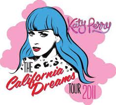
            These themes and representations also continue onto Katy’s official website, which is bright and clean. It uses pastel pinks against black for contrast and to stand out and light, muted colours in the background for a ‘vintage’ feel, possibly hinting at the theme of ‘nostalgia’ again and appealing to older generations. A cartoon stylised image of Katy with blue hair is seen on a link at the side, which again reiterates her ‘quirky’ and youthful persona and appeals to a younger audience.


            When seeing Perry’s tour-diaries and interviews, it appears that she is a very fun, bubbly woman who is confident and enjoys what she does. She is seen constantly smiling, laughing or having a fun time. This genuine personality and likability is what really attracts her audience and is one of the main reasons she has such a large fan-base. Despite the make-up, wild wigs and costumes, slim body, sex-appeal and talent, the way she appears on stage and what the public see of her through various outlets is extremely appealing and compliments her style of up-beat pop perfectly. Obviously what the public does see is largely down to the record label and it is possible that some videos have been largely edited to only show specific appealing clips. However, some clips do show Katy swearing which is obviously not appropriate for all audiences; these clips do on the other hand, show Katy just being herself which is evidently appealing for older audiences.

            Her performances at concerts also have huge appeal, as she appears as a friend to whole audiences and seems to act very natural on-stage whilst still maintaining an almost flawless performance of dance and music. For example, as she steps from the stage to greet a fan at the front row of a concert on her tour, she says, “Woah, don’t freak out! I’m just a human!” Again this could be fairly dictated by the label, but these performances are a large part of what makes her so enjoyable.

Tuesday 25 October 2011

Shot list

Extreme Close Up Shot - By using this shot consecutively,  prior to a Medium shot or Medium-Long shot, the artist can be shown in two different perspectives. For example, one shot can display not only the artist but also the inflatable chair and guitar, whereas the next could simply be the Extreme Close Up of the artists face. This giving the effect of continuity. This shot could also be used to show the artists lips whilst singing, potentially adding significance to the lyrics of the song.


Long Shot - A long shot can be used to show a location or scene in full. In this case no specific details will be focused upon and the artist will simply be seen to compliment his surroundings. 


Over The Shoulder Shot - This shot could be used to show the perspective or view of the artist himself. An example of such, is when the artist is observing a location himself, or walking. 


Medium Shot -  This shot enables the artist to be shown in full body, however the surrounding environment is not featured much. This could be used so that the audience can still read the lips of the artist as he is singing the lyrics however they can also see his body language and other relevant objects or parts of the location.

Sunday 23 October 2011

Production shots 3

Photos taken whilst filming 3 separate scenes at different locations on the third day of filming.


The ligting in this location was great, as it made for interesting shadows being cast on our character and created a naturalistic atmosphere.


We used this location to shoot from on side of the road to the other, in order to capture cars simple driving past as our character/artist played the song, showing further uncaring and nonchalance from the public.


We involved two extras here to again reiterate distance between the character and the public, as they show no interest in the artist and continue to talk as he plays.


This shot also worked well as it showed cars simply driving round the artist without caring. Showing him centred in the roundabout again brought in the themes of isolation and distance.